
How to Create Blog Images Without a Designer
You don’t need to be a graphic designer to create good-looking blog images.
You don’t even need to learn Photoshop.
For most bloggers, the bigger problem isn’t knowing how to design. It’s knowing what image to create, where to put it, what size to use, and how to make it look consistent from one article to the next.
That’s especially true when you’re running a website by yourself.
You write the article. You do the research. You publish it. Then you realize the post still needs a featured image, a few visuals, maybe an infographic, and a Pinterest graphic.
It can feel like another job.
The good news is that you can create blog images without a designer by combining a few simple tools and a repeatable workflow.
You don’t need 20 templates or a collection of expensive design software. You need a repeatable system.
This guide shows you how to create blog images without a designer—you can build a simple blog image workflow with AI tools and Canva .from deciding what each image should do to creating, resizing, optimizing, and uploading it to WordPress.
Quick answer: Start with one simple visual system. Use AI to generate an image or illustration when you need original visuals, use Canva to add your headline and branding, export the right size, compress the image, and upload it to WordPress with a descriptive filename and useful ALT text.
What Makes a Good Blog Image?
Before opening Canva or an AI image generator, decide what the image is supposed to accomplish.
A good blog image doesn’t exist just because the page has an empty space.
It should do at least one useful job.
For example, an image might:
- Explain an idea
- Show a process
- Summarize a section
- Break up a long page
- Help readers scan the article
- Show a product or interface
- Encourage someone to save or share the content
That’s why I wouldn’t use the same type of image throughout an entire article.
A blog post can use several visual formats:
Hero image
Used at the top of the article and as the featured image.
Concept image
Helps explain an idea or topic.
Screenshot
Shows readers what a real product, dashboard, or process looks like.
Infographic
Summarizes information visually.
Checklist
Turns a long explanation into something easy to scan.
Pinterest graphic
Turns the article into a separate piece of visual content for distribution.
The goal isn’t to create more images.
The goal is to create the right images.
Start With an Image Plan, Not a Design Tool
This is probably the biggest time saver.
Don’t write a 2,000-word article and then randomly search for six images.
Instead, decide during the content planning stage which sections actually need a visual.
For example, a beginner WordPress article might use:
- One hero image
- One domain + hosting diagram
- One WordPress setup screenshot
- One theme comparison graphic
- One final checklist
That’s enough.
You don’t need an image after every paragraph.
In fact, too many images can make a tutorial harder to follow.
A simple rule is:
One useful visual every few major sections is usually better than one decorative image after every paragraph.
This is also easier to maintain when you update old articles.
For a site like SoloBizStack, I’d rather have five useful images that match the article than twelve generic AI illustrations.
The Easiest Blog Image Workflow for Beginners
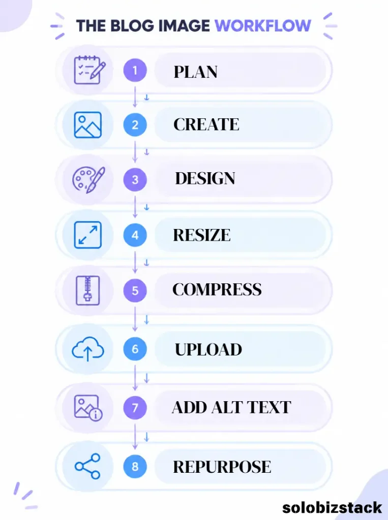
A simple workflow looks like this:
Article idea
↓
Decide what the image needs to show
↓
Choose the image type
↓
Generate or find the visual
↓
Design it in Canva
↓
Resize and export
↓
Compress the image
↓
Upload to WordPress
↓
Add filename and ALT text
↓
Reuse it for Pinterest or social media
Once you’ve done this a few times, the process becomes much faster.
The important thing is to separate image creation from design.
AI can help you create the raw visual.
Canva can help you turn it into a finished content asset.
Step 1: Create a Simple Visual Style
You don’t need to create a completely new design for every article.
That’s actually one of the easiest ways to make a website look inconsistent.
Choose a few things and stick with them:
Brand colors
Pick two or three main colors.
For SoloBizStack, you might use your existing brand colors as the base and allow images to introduce softer supporting colors.
Fonts
Use the same headline and body fonts across your graphics.
Layout
Decide where your headline usually goes.
For example:
Left side = headline
Right side = visual
Or:
Top = headline
Center = image
Bottom = website branding
You don’t need to reinvent this for every post.
Branding
Your logo doesn’t need to appear huge.
A small SoloBizStack mark in a consistent location is usually enough.
The goal is recognition—not turning every graphic into an advertisement.
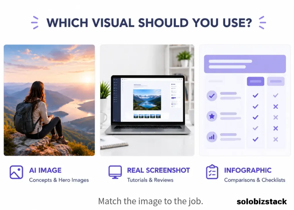
Step 2: Choose the Right Type of Image
This is where most beginners overcomplicate things.
Use an AI-generated image when:
- You need an original hero image
- You want a specific scene
- You need a conceptual illustration
- A stock photo doesn’t fit
- You need a consistent visual style
Use a real screenshot when:
- You’re reviewing software
- You’re showing a WordPress setting
- You’re explaining a dashboard
- You’re demonstrating a tool
- The actual interface matters
A fake AI-generated dashboard is a bad substitute for a real screenshot.
If you’re reviewing Hostinger, for example, a real Hostinger interface tells the reader much more than an AI-generated laptop screen.
Use Canva for:
- Checklists
- Comparison graphics
- Step-by-step diagrams
- Simple charts
- Pinterest Pins
- Branded layouts
This mix usually produces a better article than relying on one type of image for everything.
Step 3: Use AI to Generate the Raw Image
You don’t need a complicated prompt.
Start with five basic things:
Subject
What should the image show?
Context
Where is the scene happening?
Style
Realistic photography? Editorial? Illustration?
Composition
Where should the main subject appear?
Negative space
Where will your headline go?
For example:
“Create a realistic editorial image of a solo entrepreneur working on a laptop in a bright minimalist home office. Show a website planning document on the desk. Position the person and laptop on the right side and leave clean negative space on the left for a headline.”
That’s usually more useful than:
“Make a beautiful AI blog image.”
The second prompt doesn’t give the image model enough direction.
Step 4: Generate Images Without Text When Possible
One useful trick is to separate image creation from text design.
Instead of asking an AI image generator to create:
“BEST WEBSITE HOSTING FOR BEGINNERS”
inside the image, generate the clean visual first.
Then add your headline in Canva.
This gives you much more control over:
- Font
- Spacing
- Line breaks
- Brand colors
- Mobile readability
- Future edits
Canva currently lets you generate AI images from its dedicated AI tools and then continue editing the result in the Canva editor. It also offers background tools and other AI-assisted editing features.
That makes the AI → Canva → publish workflow particularly convenient for bloggers.
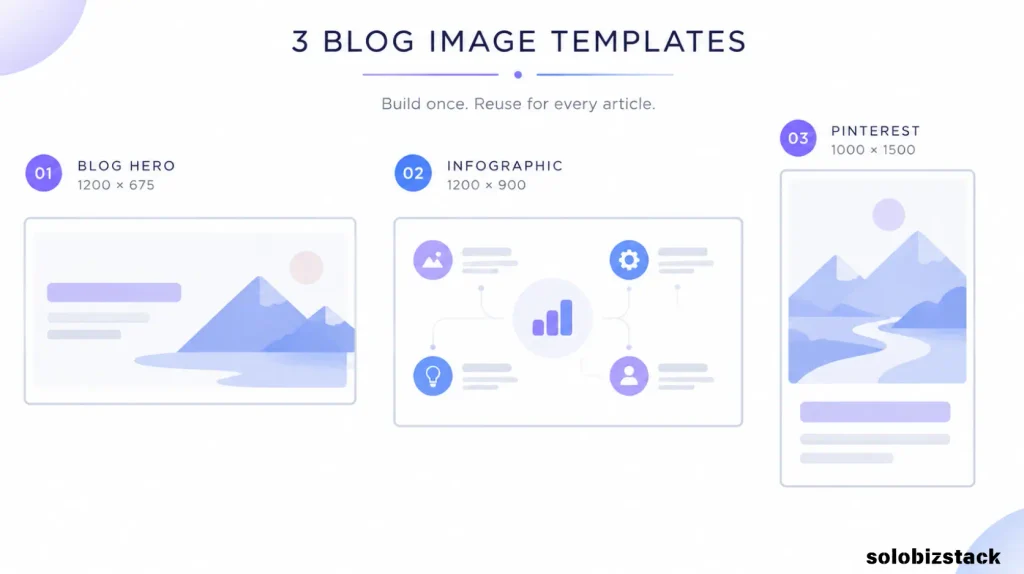
Step 5: Build Three Canva Templates
You don’t need twenty templates.
Start with three.
Template 1: Blog Hero
Recommended working size:
1200 × 675 px
Layout:
┌────────────────────────────┐
│                            │
│  BLOG TITLE                │
│  Short subtitle            │
│                            │
│                  IMAGE     │
│                            │
│  SoloBizStack              │
└────────────────────────────┘
Use this for article featured images.
Template 2: Blog Infographic
Recommended working size:
1200 × 900 px
Use this for:
- Comparisons
- Checklists
- Processes
- Feature summaries
Keep the number of words on the image low.
If a reader needs to zoom in to understand your infographic, there’s probably too much information on it.
Template 3: Pinterest Pin
A vertical 2:3 format works well for Pinterest. Canva currently lists 735 × 1,102 px as its reference size for portrait Pins; you can also build a larger 2:3 working file and export a high-quality version.
For example:
1000 × 1500 px
Layout:
┌──────────────────────┐
│                      │
│  BIG HEADLINE        │
│                      │
│  Short promise       │
│                      │
│      MAIN IMAGE      │
│                      │
│  3 quick points      │
│                      │
│  SoloBizStack        │
└──────────────────────┘
Once the template is ready, you don’t have to start over for every Pin.
Canva’s resize functionality can also help turn one design into different formats, although availability depends on the plan.
Step 6: Use Screenshots for Tutorials
Screenshots are one of the easiest ways to make a tutorial more useful.
If you’re explaining:
- WordPress settings
- Rank Math
- Hostinger
- SiteGround
- Canva
- A plugin
- A dashboard
show the actual screen when possible.
You don’t need a complicated editing program.
Take the screenshot, then use Canva to:
- Crop unnecessary areas
- Add arrows
- Add numbered labels
- Highlight the button
- Blur personal information
- Add a short caption
This is especially important for review content.
A real interface helps the reader understand what they’ll actually see.
Step 7: Create Simple Infographics Without Being a Designer
You don’t need a design degree to create an infographic.
Start with a list.
For example:
Website Hosting Checklist
✓ WordPress Support
✓ SSL
✓ Backups
✓ Customer Support
✓ Easy Setup
✓ Room to Grow
Then turn each item into a simple visual card.
Keep the layout consistent.
You don’t need:
- Ten colors
- 3D icons
- Complex illustrations
- Decorative shapes everywhere
A clean layout with good spacing usually looks more professional.
The same principle works for:
Comparison tables
Step-by-step guides
Pros and cons
Checklists
Beginner roadmaps
The reader should understand the image in a few seconds.
Step 8: Keep Text on Images Short
One of the biggest mistakes beginners make is writing the entire paragraph on the graphic.
Don’t.
Your article contains the details.
The image should create a quick visual summary.
For example, instead of:
“When choosing the best website hosting provider for beginners, you should consider the price, renewal cost, customer support, backup options, performance, WordPress compatibility, and…”
Use:
WHAT TO LOOK FOR
Price
Support
Backups
WordPress
Performance
The article does the explaining.
The image helps the reader remember the main points.
Step 9: Optimize Images Before Uploading Them
A beautiful image that slows down your website isn’t doing you many favors.
Modern image formats such as WebP can reduce file size compared with JPEG or PNG at similar visual quality, although the exact savings depend on the image and compression settings. Google documents WebP as a modern web image format with smaller file sizes and broad browser support.
Before uploading an image:
- Resize it to the size you actually need
- Compress it
- Use WebP when appropriate
- Avoid uploading giant original files
- Keep text sharp enough to read
For example, there is little reason to upload a 6000px-wide image when the content column on your website only displays it at roughly 1200px.
Large image files can add unnecessary page weight. Google notes that images can make up a substantial share of page bytes, so image size is worth paying attention to.
Step 10: Upload the Image Properly in WordPress
WordPress’s Image block lets you upload an image, select one from the Media Library, choose resolution settings, add captions, and add ALT text. You can also set an image as the featured image from the Image block interface.
After uploading, check:
File name
Instead of:
IMG_8293.jpg
use something descriptive:
wordpress-blog-image-checklist.webp
ALT Text
Describe what the image actually shows.
For example:
WordPress website launch checklist for beginners
Not:
wordpress website checklist wordpress blog images SEO best WordPress image
Google specifically recommends descriptive filenames and useful ALT text, while warning against keyword stuffing. ALT text also supports accessibility for people using screen readers.
Caption
Use one when the image benefits from explanation.
You don’t need a caption for every decorative image.
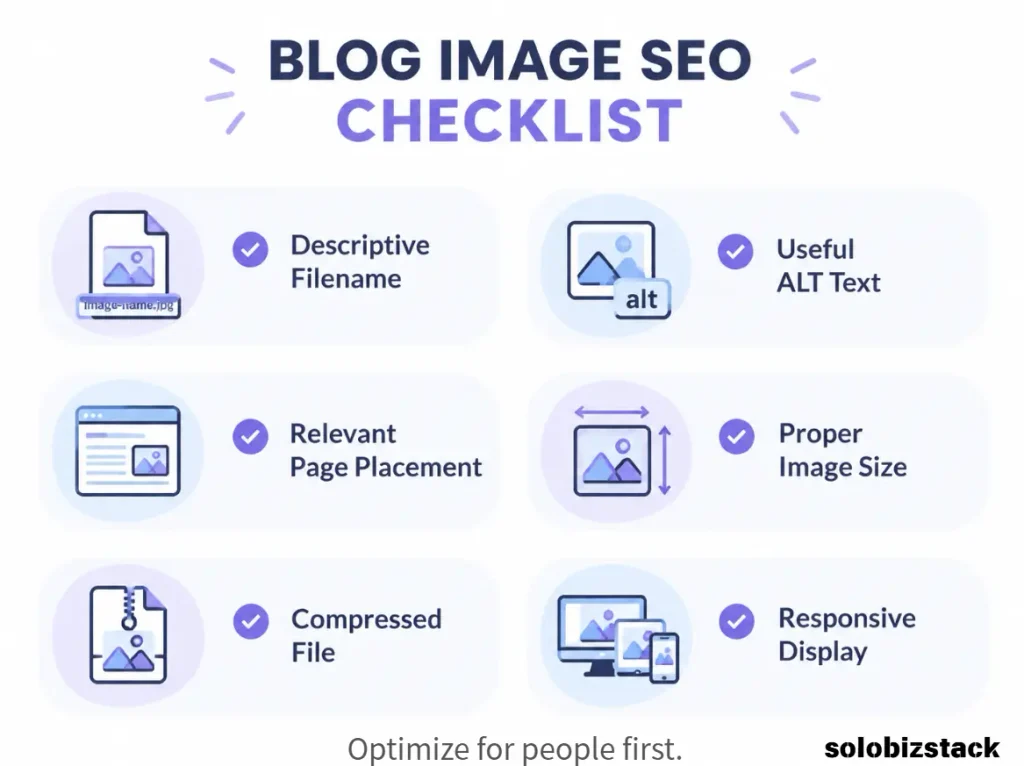
Step 11: Don’t Use the Same ALT Text for Every Image
Suppose your article has five images.
Don’t write:
How to create blog images without a designer
on all five.
Describe each image.
For example:
Hero:
Creating blog images without a designer
Workflow diagram:
Blog image creation workflow from idea to WordPress
Screenshot:
Canva editor used to create a blog hero image
Checklist:
Blog image publishing checklist for WordPress
Pinterest graphic:
Vertical Pinterest graphic for a blog article
Google uses ALT text together with page content and computer vision to understand image subject matter, and explicitly recommends avoiding keyword stuffing.
Step 12: Turn One Blog Image Into Multiple Assets
This is where the workflow gets much more valuable.
Don’t think:
One article = five images
Think:
One visual concept = several content assets
For example:
Blog article
1200 × 675 hero
↓
1000 × 1500 vertical version
↓
Social post
Square or portrait version
↓
Cropped visual
↓
Content upgrade
Checklist or mini infographic
You can start with one visual idea and adapt it to several formats.
That means the time you spend creating the original concept keeps working for you.
Step 13: Use Real Screenshots for Product Reviews
This deserves its own rule.
If you write:
Hostinger Review
show Hostinger.
If you write:
Canva Review
show Canva.
If you write:
Rank Math Tutorial
show Rank Math.
Don’t use a fictional AI-generated interface just because it looks cleaner.
A real screenshot gives the reader information an invented picture can’t provide.
A reader deciding whether to try a tool wants to know:
What does this actually look like?
A screenshot answers that question immediately.
Step 14: Keep Your Blog Images Consistent
After a few months, you don’t want your site to look like ten different people designed it.
Create a simple visual system.
For example:
Hero images:
Clean editorial image + large headline
How-to articles:
Screenshot + annotations
Comparisons:
Two-column comparison graphic
Checklists:
Simple cards with checkmarks
Tool reviews:
Real screenshots + product-focused graphic
Pinterest:
Large headline + strong central visual
That’s enough.
You don’t need a different visual identity for every article.
How Many Images Should a Blog Post Have?
There isn’t a magic number.
A 1,000-word article may only need three or four images.
A long tutorial may benefit from more because screenshots actually help explain the process.
For most SoloBizStack articles around 1,500–2,500 words, I would start with:
1 hero image
3–5 useful in-content images
1 Pinterest graphic
Then adjust based on the article.
If a section is already easy to understand from the text, don’t add an image just to hit a quota.
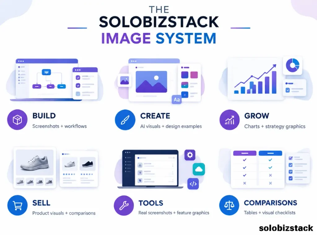
A Simple Blog Image System for SoloBizStack
I’d use this structure:
Build articles
More screenshots and workflow diagrams.
Create articles
More AI-generated visuals and design examples.
Grow articles
Charts, process graphics, and strategy diagrams.
Sell articles
Product screenshots, comparison graphics, and service visuals.
Tools articles
Real product screenshots plus simple feature graphics.
Comparison articles
Side-by-side tables and visual checklists.
This means me images become part of me content architecture rather than random decoration.
A Beginner-Friendly Tool Stack
You don’t need five design subscriptions.
A simple setup could be:
Canva
Use it for:
- Templates
- Blog graphics
- Infographics
- Screenshot annotations
Canva currently also offers AI image generation and editing directly from its AI tools, so you can move from generated visual to finished design without leaving the platform.
AI Image Generator
Use one tool that fits your style.
You don’t need three subscriptions just to create blog headers.
For a broader comparison, see:
[Best AI Image Generators for Content Creators →]
WordPress
Use the WordPress editor to upload, position, caption, and manage your images. WordPress’s Image block also supports ALT text and resolution settings.
[How to Build a WordPress Website for Beginners →]
A 10-Minute Blog Image Workflow
Once your templates are ready, you can make the process surprisingly simple.
Minute 1
Read the article and identify the most important visual idea.
Minutes 2–4
Generate or find the base image.
Minutes 5–7
Open your Canva template and replace the old visual.
Minute 8
Add the headline, logo, and any simple labels.
Minute 9
Resize and export.
Minute 10
Rename the file and add ALT text in WordPress.
That’s the goal.
Not creating perfect art.
Creating good, useful visuals consistently.
Final Blog Image Checklist
Before publishing an article, ask:
Content
- Does the image help explain something?
- Is it relevant to the section?
- Does it add something beyond the text?
Design
- Is the text easy to read?
- Is the branding consistent?
- Does the image look good on mobile?
- Did I avoid unnecessary decoration?
SEO
- Is the filename descriptive?
- Does the image have useful ALT text?
- Is the image placed near relevant content?
- Is the image compressed?
- Is the format appropriate?
Google recommends descriptive filenames and ALT text, and also recommends placing images near relevant text on the page.
Publishing
- Featured image is set
- All important screenshots are readable
- Images don’t cause horizontal scrolling
- Pinterest version is ready
- Affiliate/product screenshots are accurate
Frequently Asked Questions
Can I create blog images without a designer?
Yes. A simple combination of an AI image generator, Canva, and WordPress is enough for many blogs. The key is to use templates and a consistent visual system rather than designing every image from scratch.
Is Canva enough to create blog images?
For many bloggers, yes. Canva can handle templates, layouts, text, screenshots, infographics, resizing, and AI-generated images. Its current AI tools also let you generate images and continue editing them in Canva.
Should I use AI-generated images or stock photos?
Either can work. Use AI when you need a specific scene or visual style. Use stock photography when a real-world photo is more appropriate. For software reviews and tutorials, real screenshots are usually more useful than either.
What size should a blog featured image be?
There isn’t one universal WordPress size because themes and layouts vary. For a modern blog layout, 1200 × 675 px is a practical working size for a 16:9 hero image. Check your theme’s featured-image layout before locking in a final template.
What size should Pinterest images be?
A 2:3 portrait format is a practical choice for Pinterest. Canva currently lists 735 × 1,102 px as its reference size for portrait Pins.
Does ALT text help SEO?
ALT text helps search engines understand image content and also improves accessibility. Google recommends descriptive ALT text that is relevant to the image and warns against keyword stuffing.
Should every blog image have ALT text?
Meaningful images should generally have useful ALT text. Decorative images can be marked as decorative instead. WordPress supports both approaches in the Image block.
Should I put keywords in image filenames?
Use descriptive filenames that naturally describe the image. Google says filenames provide light clues about the image subject, but they should remain short and descriptive rather than stuffed with keywords.
Final Thoughts
You don’t need to become a designer to make your blog look professional.
You need a system.
Choose the right image for the job. Generate or capture the visual. Drop it into a reusable Canva template. Add your branding. Resize it. Compress it. Upload it with a descriptive filename and useful ALT text.
Then reuse the idea for Pinterest or social media.
Once you’ve built three or four templates, the process gets much easier.
The real goal isn’t to make every image spectacular.
It’s to make your website look clear, consistent, useful, and worth spending time on.
And that’s something a solo blogger can absolutely handle without hiring a designer for every article.
[Read Best AI Image Generators for Content Creators →]
[Read Best AI Writing Tools for Bloggers →]
[How to Build a WordPress Website for Beginners →]
Prices, features, AI credits, and software plans can change. Check the provider’s current website before subscribing.

One Comment