How to Create Blog Graphics Without Canva Skills
How to create blog graphics without Canva skills is simpler than it sounds. You don’t need to learn every design feature, memorize typography rules, or spend hours adjusting tiny details. A good template, a clear image, and a few simple design habits can take you a long way.
If you’re running a blog on your own, design is probably only one item on a long to-do list. You still have articles to write, keywords to research, links to check, and content to promote. Spending an entire afternoon creating one featured image is rarely a good use of your time.
The easier approach is to build a small, repeatable system. Choose a layout that works, replace the text and image, keep your colors and fonts consistent, and save the design for next time.
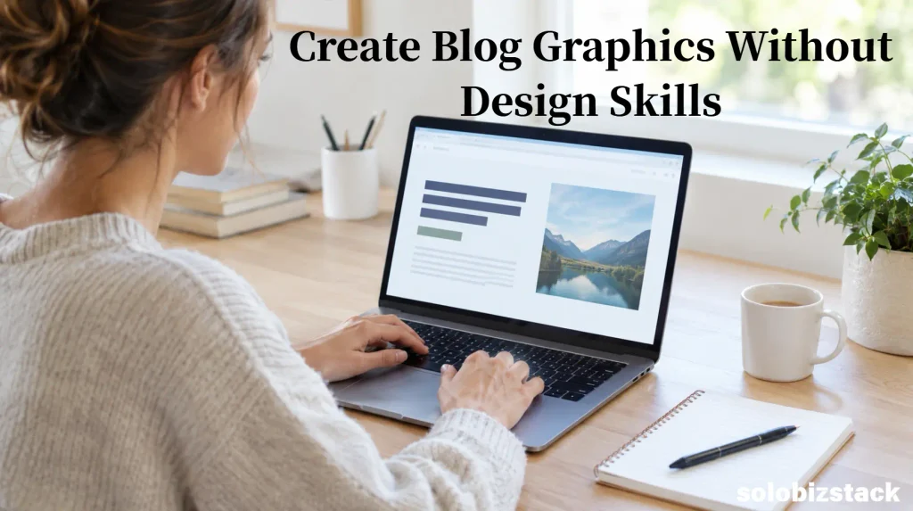
In this guide, you’ll learn how to create blog graphics without needing advanced Canva skills, which shortcuts are genuinely useful, how AI can help, and what to check before uploading images to WordPress.
Affiliate Disclosure: This article may contain affiliate links. If you purchase through these links, SoloBizStack may earn a commission at no extra cost to you. We aim to provide useful, honest information to help you make an informed decision.
What Counts as a Blog Graphic?
A blog graphic is any visual you create to support an article or help people discover it. It doesn’t have to be an elaborate illustration or a complicated infographic.
For most blogs, a few basic formats are enough:
- Featured images: The main visual used to represent an article on your website.
- Supporting graphics: Images that explain an idea, summarize a process, or break up a long section.
- Checklists and diagrams: Simple visuals that help readers understand or remember information.
- Comparison graphics: Visual summaries of tools, features, or options.
- Pinterest graphics: Vertical designs created to help people discover your content on Pinterest.
These formats have different jobs. A featured image should represent the article clearly, while a checklist should make information easier to scan. A Pinterest graphic needs to communicate its topic quickly in a vertical layout.
You don’t need to create all five for every article. Start with the visual that would help your reader most, then add more only when they serve a clear purpose.
Step 1: Decide What the Graphic Needs to Do
Before opening Canva, ask one simple question: What should this image help the reader understand?
The answer determines the kind of graphic you need.
Suppose you’re writing an article about choosing a WordPress theme. A featured image might show a person reviewing website layouts on a laptop. A supporting graphic could compare the main factors to consider when choosing a theme.
For an article about content planning, a simple calendar illustration may communicate the idea more clearly than a random photo of someone typing.
If you can’t explain why an image belongs in the article, you may not need it.
Choose the image type first
Use a photo when the topic involves a person, workspace, product, or real situation. Use a diagram when you need to explain a process. Use a checklist when readers need to remember several steps.
For software tutorials, authentic screenshots can be more useful than generic illustrations because readers can see the actual interface. If you use screenshots, make sure they’re current and that you remove private information.
The goal isn’t to make every page look decorative. It’s to make the content easier to understand.
Step 2: Start With a Template Instead of a Blank Page
One of the easiest ways to create graphics without design experience is to start with an existing layout.
Open Canva and look for a template that matches the type of graphic you need. You might search for a blog banner, blog post graphic, checklist, comparison infographic, or Pinterest Pin.
Don’t choose a template just because it looks attractive. Look for one that gives your content enough room.
A template with large decorative headings and lots of boxes may not work well for a simple featured image. A clean layout with space for one headline and one strong visual is often easier to adapt.
How to choose a useful template
Look for three things:
A clear visual hierarchy. The headline should be easy to notice, and the supporting visual should help explain the topic.
Enough empty space. You need room for your own words and images. A crowded design is difficult to fix by simply changing the colors.
A layout you can reuse. Choose something you can adapt for several articles without rebuilding the whole composition.
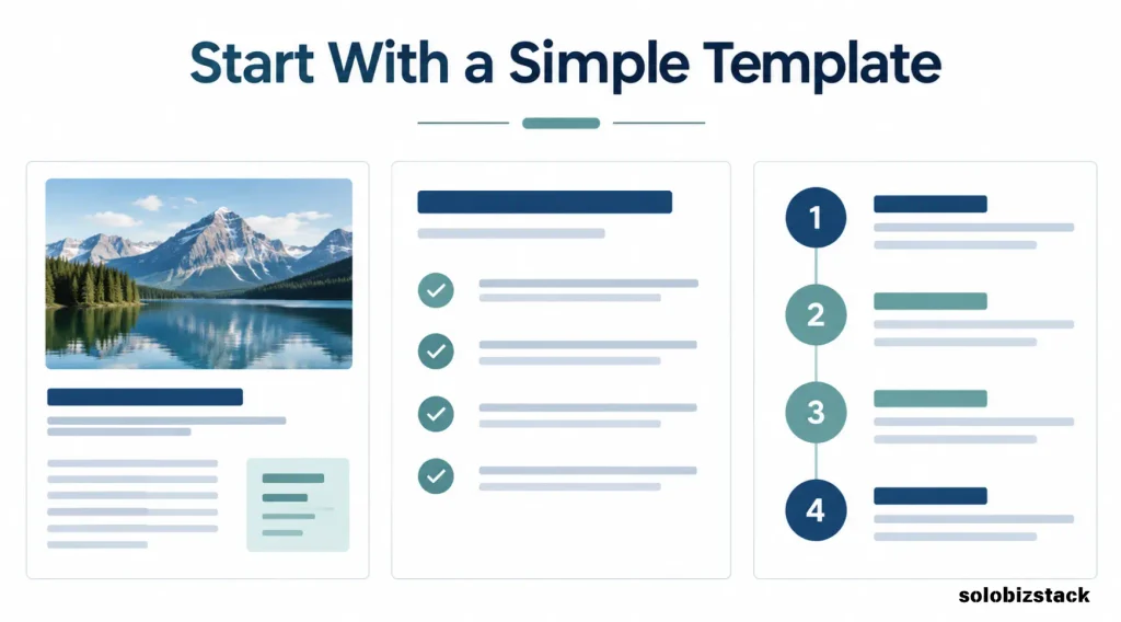
Canva’s template library provides starting layouts, while its Magic Design tools can help generate design ideas from a prompt or supplied content. Features and usage limits can vary by account and plan, so check what is available in your own account.
You don’t have to use the first template Canva suggests. Try a few options, then choose one that’s easy to read and fits your website’s style.
Step 3: Use This Simple Design Formula
You don’t need to understand every design principle to make a clean blog graphic. Start with four elements:
- One clear headline.
- One main image or visual.
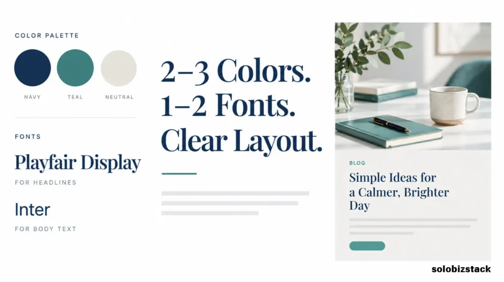
- Two or three consistent colors.
- A simple brand detail, such as a small website name or logo.
That’s enough for many featured images and supporting graphics.
Keep the headline short
Your image should communicate one main idea. If the headline needs several lines to explain the entire article, shorten it.
For example, a blog post titled How to Create a Content Strategy for a New Blog could use the graphic headline:
Plan Your First 90 Days of Blog Content
The image doesn’t have to repeat the complete article title word for word. It should reflect the same topic and make sense when someone sees it outside your website.
Use a small color palette
Choose two or three colors that work with your website’s existing style. Use one for the main text, another for accents, and a light or dark neutral for the background.
You don’t need to use every color in your brand palette on every image.
Consistency matters more than complexity. When readers see several images from the same website, a repeated color palette and layout can help them recognize the visual style.
Stick to one or two fonts
Too many fonts make a design feel unsettled. Choose one readable font for headings and, if necessary, a second for smaller text.
Avoid decorative fonts for long text. They can be difficult to read, especially when the image appears on a phone.
The same rule applies to text size. If you have to shrink a headline to make everything fit, remove a few words or choose a less crowded layout instead.
Step 4: Replace the Template’s Content, Not Just Its Colors
A template is a starting point, not a finished graphic.
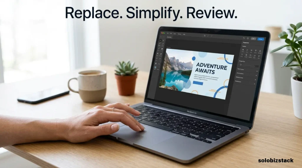
Once you’ve chosen a layout, replace the sample headline, images, labels, and decorative elements with content that’s relevant to your article.
For a featured image, this might mean keeping the headline and image simple. For a checklist, it might mean changing the template’s sample steps into three or four useful points from your article.
Remove anything that doesn’t serve the message. You rarely need every icon, sticker, border, shape, and text box included in the original design.
Before you finish, zoom out and look at the graphic as a reader would. Can you understand the main idea in a few seconds? Does the headline stand out? Is the image doing something useful?
If the answer is yes, you’re probably closer to a finished design than you think.
Step 5: Use AI When You Need a Specific Image
Sometimes a template is fine, but the available photos don’t match your article. That’s where AI image generation can be useful.
For example, if you’re writing about content planning for solo entrepreneurs, you might need a realistic image of someone organizing article ideas at a laptop. If you’re explaining a workflow, a simple custom illustration may be more appropriate than a stock photo.
You can generate a visual using an image tool, then upload it into Canva and place it within your template.
A simple AI image prompt
Try a prompt with four parts:
- Subject: What should appear in the image?
- Setting: Where is the scene taking place?
- Style: Realistic photography, flat illustration, or another visual style?
- Composition: Where should the main subject appear, and where do you need empty space?
For example:
“Create a realistic editorial photograph of a solo blogger planning article ideas at a laptop in a bright minimalist home office. Include a notebook and pen on the desk, use natural window light, and place the person and laptop on the right side. Leave clean negative space on the left for a headline. No brand logos and no readable text on the screen.”
That prompt gives the image model a clear subject, setting, lighting, and layout.
Don’t ask AI to create the finished graphic in one step
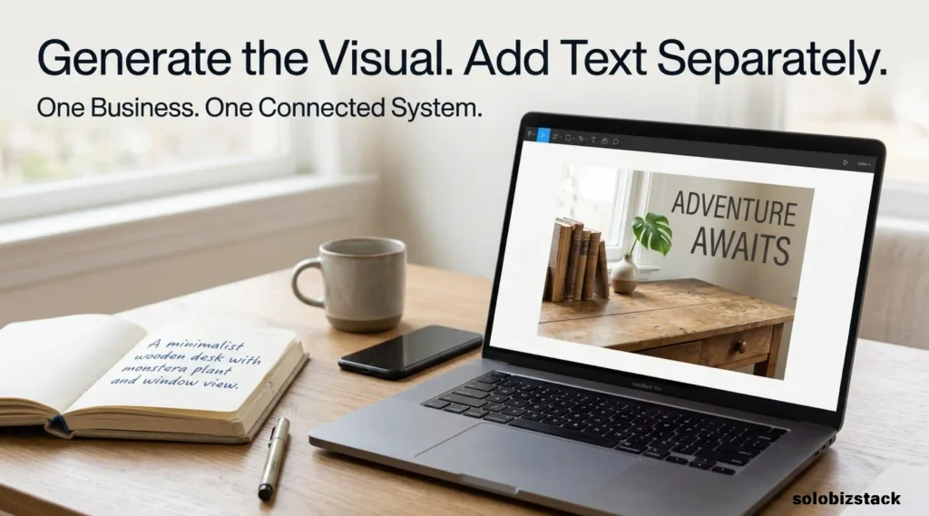
If the image needs a specific headline, brand name, or detailed checklist, it’s usually easier to generate the background first and add the words in Canva.
AI-generated text can contain spelling mistakes or look distorted. Adding text separately gives you control over the font, wording, contrast, and spacing.
Also, don’t use an AI-generated mockup as though it were a real screenshot from a product. If you’re explaining a particular tool, show an accurate interface or use a clearly labeled illustration.
Step 6: Keep Your Graphics Consistent Across Articles
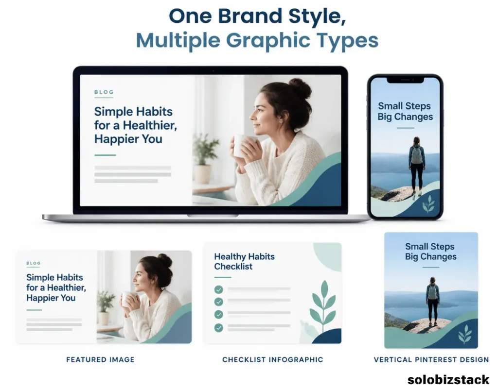
You don’t need a unique design style for every post. In fact, making each article look completely different can create more work and make your website feel less cohesive.
Create two or three reusable templates:
Template A: Featured image. One short headline, one main image, and a simple brand detail.
Template B: Checklist or tutorial graphic. A clear heading, a few steps or icons, and enough space to read the content.
Template C: Pinterest Pin. A vertical layout with a prominent headline and visual that communicates the article’s benefit.
Save these templates in Canva and duplicate the appropriate one when you start a new article. Then replace the text and image rather than redesigning every element.
Your graphics don’t have to be identical. The goal is to create a recognizable style while adapting the layout to the information.
For more ways to turn blog articles into shareable visuals, read our guide to creating Pinterest Pins for your blog.
Step 7: Choose the Right Dimensions for the Job
A graphic that looks good in Canva may not fit properly when you upload it to WordPress or share it on Pinterest.
There isn’t one perfect size for every blog image. Your featured image should fit your WordPress theme’s layout, while an inline diagram or checklist may need different proportions. Pinterest graphics use a separate vertical format.
Before creating a batch of graphics, check your theme’s recommended featured image dimensions and preview how images appear in your actual posts.
For Pinterest, a 2:3 vertical ratio is a useful starting point for standard image creative. For your blog, use dimensions that suit your layout and avoid uploading unnecessarily large files.
Create separate versions when the same idea needs to work in different places. Don’t stretch a small image to fill a large canvas, and don’t force a wide featured image into a tall Pinterest layout without rearranging the content.
Step 8: Export Your Graphic and Prepare It for WordPress
Once the design is finished, download it in a format that suits the image.
WebP can be a good choice for website images because it can reduce file size while maintaining useful visual quality. JPEG and PNG may also be appropriate depending on the graphic, transparency, and the way you plan to use the file.
After exporting, check these details:
- Is the image sharp at the size it will appear on the page?
- Is the file larger than it needs to be?
- Does the image fit the article layout?
- Are the colors and text still clear?
- Have you saved a reusable source design for later editing?
Compress the image if needed, but avoid compressing it so much that text becomes blurry or fine details disappear.
Google’s image SEO best practices recommend high-quality images, descriptive file names, useful alt text, and attention to page performance. Those practices help both readers and search engines understand your visuals.
Step 9: Use Descriptive File Names and ALT Text
Creating a good-looking graphic is only part of the job. You should also prepare the image properly before uploading it to WordPress.
Give the file a meaningful name
Avoid names such as final-image-3.png or design-new.png.
Use a short, descriptive filename that reflects what the image shows. For example:
how-to-create-blog-graphics-without-canva-skills.webp
For an image showing a blog workflow, a suitable filename might be:
blog-graphic-design-workflow.webp
Use lowercase letters and hyphens, and avoid stuffing several versions of the same keyword into the filename.
Write useful ALT text
ALT text describes the actual image for people who cannot see it and helps search engines understand its subject.
For example, if your image shows a blogger editing a design on a laptop, useful ALT text might be:
“Beginner blogger customizing a blog graphic template on a laptop.”
Don’t simply repeat the article’s main keyword on every image. Describe what each image actually communicates. If an image is purely decorative and adds no information, it may not need descriptive ALT text.
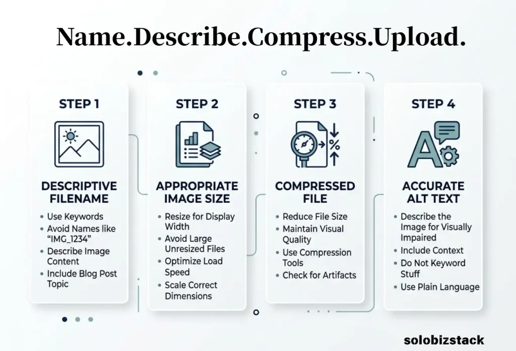
Google’s image SEO guide explains why descriptive filenames and meaningful alt text matter. These are useful accessibility and image-understanding practices, not a guarantee that an image will rank in Google Images.
Step 10: Use Another Tool if Canva Doesn’t Suit You
Canva is convenient for template-based graphics, but it isn’t the only option. If you find its interface confusing or prefer a different workflow, try a tool that makes the basics easier for you.
Adobe Express
Adobe Express offers templates and straightforward editing tools for creating graphics and other content. Its free plan includes design templates and standard editing features, although some assets and capabilities require a paid plan.
It’s worth comparing if you already use Adobe products or prefer its interface.
Explore Adobe Express.
AI image tools
AI image tools can create a background or illustration from a text prompt. They’re useful when you need an image that matches a specific concept, but you’ll still need to check the result, add any precise text, and prepare the image for your website.
If you’re comparing options, see our guide to creating blog images without a designer. It covers the broader workflow from choosing a visual to preparing it for publication.
The tool matters less than the process
You can use Canva, Adobe Express, or another suitable tool. What matters most is that you can produce a clear graphic, reuse the layout, export the right file, and finish the task without unnecessary effort.
Don’t spend days switching between tools when a simple template would solve the problem.
Step 11: Turn Your Blog Graphic Into a Pinterest Pin
A blog image can sometimes be reused to promote the article, but a standard featured image and a Pinterest Pin serve different purposes.
A featured image should work within your website’s layout. A Pinterest Pin usually needs a vertical composition and a headline that makes sense in a feed.
You may be able to reuse the original photo, illustration, or color palette, but rearrange the content for the new format.
For example, a featured image might have a short headline and a landscape photo. A Pinterest version could use the same photo in a vertical layout with a more specific headline and a short supporting phrase.
Don’t simply stretch the original graphic. Create a version that suits the platform and accurately represents the article.
For a step-by-step guide, read How to Create Pinterest Pins for Your Blog.
A Simple 10-Minute Blog Graphic Workflow
Once you have a few reusable templates, you can make the process much quicker.
Minutes 1–2: Choose the purpose. Decide whether you need a featured image, a diagram, a checklist, or a Pinterest graphic.
Minutes 3–4: Pick a template. Open the saved layout that fits the job.
Minutes 5–7: Replace the content. Add your headline, image, colors, and any short labels you need.
Minute 8: Review the design. Check contrast, spacing, and readability at a small size.
Minute 9: Export and optimize. Save the image in a suitable format and compress it if necessary.
Minute 10: Prepare the WordPress upload. Give the file a descriptive name and add appropriate ALT text.
The timing is a rough target, not a rule. Your first few graphics may take longer. The main benefit comes from reusing a process rather than redesigning everything from scratch.
Common Blog Graphic Mistakes to Avoid
Trying to Use Too Many Elements
A graphic crowded with icons, shapes, decorative lines, and multiple headlines can be hard to understand. Remove elements that don’t support the main idea.
Using Text That Is Too Small
If readers need to zoom in to understand the image, the design needs simplifying. Shorten the wording or split the information into two visuals.
Choosing Style Over Clarity
A dramatic design isn’t automatically better. If the headline is difficult to read or the image doesn’t match the article, the graphic isn’t doing its job.
Making Every Image Look Different
Constantly changing fonts, colors, and layouts creates more work and can make your site feel inconsistent. Reuse a small number of templates.
Expecting a Theme or Graphic to Fix Weak Content
A polished image can’t turn an unhelpful article into a useful one. Make sure the article itself answers the reader’s question, then use graphics to improve understanding and presentation.
Forgetting Image Optimization
Large images can slow down a page. Export the right dimensions, compress files where appropriate, and check the page after uploading.
Frequently Asked Questions
Can I create blog graphics without design experience?
Yes. Start with a suitable template, use one clear headline, choose a relevant image, and keep colors and fonts consistent. You don’t need to learn advanced design tools to create clean, useful graphics for a blog.
Is Canva free for creating blog graphics?
Canva offers free design tools and templates, but some templates, assets, and advanced features require a paid plan. Check the current options in your account before building a workflow around a specific premium feature.
Do I need Canva Pro to make professional-looking blog images?
Not necessarily. A free template and a few consistent design rules may be enough for many blogs. Consider a paid plan only when a feature you genuinely need saves time or solves a specific design problem.
Can AI create blog graphics for me?
AI can help create background images, illustrations, and design ideas. You’ll still need to review the output, correct any inaccurate details, add precise text where needed, and make sure the final graphic fits your article.
What size should my blog graphics be?
Use dimensions that fit your WordPress theme and the purpose of the image. Featured images, inline diagrams, and Pinterest graphics may need different sizes. Check the appearance of the image on desktop and mobile before publishing.
Do blog graphics help SEO?
Images can help readers understand an article, and descriptive filenames and useful alt text help search engines interpret them. Graphics alone don’t guarantee better rankings. Keep images relevant, accessible, optimized for performance, and close to the text they support.
Final Thoughts
You don’t need to become a designer to create better blog graphics. Start with a good template, choose one clear idea for each image, and keep your design simple enough to read at a glance.
Use AI when it helps you create a suitable visual, but add precise text separately and review the finished result. Save layouts you can reuse, export images at sensible dimensions, and give your WordPress uploads descriptive filenames and meaningful alt text.
The goal isn’t to make every image look impressive. It’s to help readers understand your content and give your website a consistent, professional appearance without adding hours of work to every article.